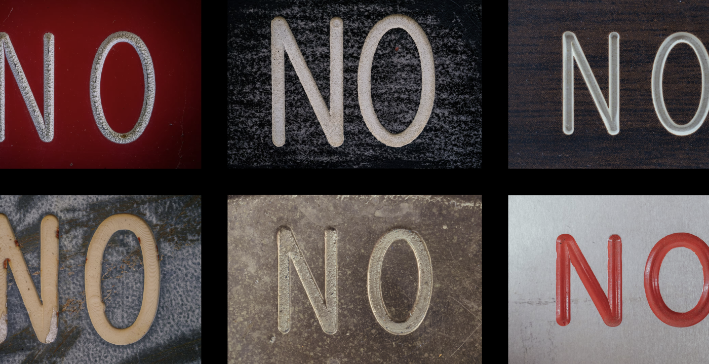
Gorton’s ugliness made it the default industrial typeface
The ugliest font ever designed became the invisible backbone of 20th-century machines — because nobody owned it, nobody named it, and nobody had to make it pretty
Gorton (1902) wasn't built for beauty. It was built to be traced by a pantograph — which is exactly why it ended up on keyboards, submarines, Apollo's onboard computer, and comic books.
Gorton spread further than almost any typeface in history not despite being crude, but because of it: a monoline shape with rounded, corner-free strokes engraves easily by machine, was never trademarked as a distinct 'font', and could be legally redrawn and resold by anyone (Leroy, Wrico, Letraset, ANSI, military specs) without naming it. Its ubiquity is a story about engineering constraints and copyright loopholes, not design merit.
How one machine-shop default became an industrial universal
- George Gorton Machine Co. catalog shows the font, unnamed, as the default pantograph 'standard copy'
- 1952Retroactively named 'Gorton Normal' once other typefaces were added to the catalog
- Keuffel & Esser (Leroy) and Wood-Regan (Wrico) reuse the shapes for lettering guides — legal because letterforms weren't copyrightable
- 1940s–50sLeroy lettering appears in EC Comics and All-Star Comics, including the first Wonder Woman issue
- 1960sLetraset rub-on sheets carry the shapes further, under names like 'Engineering Standard'
- US military codifies it as MIL-SPEC-33558 for aircraft dials, cancels it, then reinstates it; NATO/STANAG and ANSI Y14.2M follow
- 1970sComptec releases 'Gorton Modified', the only named official update, smoothing the quirks for keyboard keycaps
- 1980sDigitized into Hershey vector fonts still used in CAD software today
Where the same shapes turned up, unrelated to each other
Keyboards, typewriters, elevators, escalators, submarines, jet fighters, locomotives, subway trains
Nuclear facilities, the Kennedy Space Center's EARTH/SPACE elevator labels, Apollo's onboard computer key legends
Rulers, tape dispensers, fridges, felt-board restaurant signs, billiard balls, toothbrushes, organ keys
Comic books (Wonder Woman's debut), technical drawings under ANSI standard, National Park Service signage
Why Gorton beat hand-lettering and later held its ground
What made it win originally
- Monoline strokes with minimal sharp corners trace smoothly and fast by pantograph
- Came bundled free as the engraver's default font
- No cheap alternatives existed yet — no laser printers, no Letraset, no stencils
- Carved-in legends survive far longer than ink or paint on heavy equipment
What kept it alive later
- Letterforms were not legally protected, so any company could redraw and resell them under a new name
- It was barely ever named 'Gorton' to begin with, so it couldn't be traced or blocked
- Military and ANSI standards formally canonized a near-identical shape
- Digitization (Hershey fonts) preserved the geometry into modern CAD
A sense of scale
Gorton dates to at least 1902
all younger sans-serifs
often cited as the first modern sans-serif
from first noticing 'Gorton' as a keyboard-nerd term to identifying its full lineage
The unresolved irony
Every professional type-design instinct says Gorton is a failure: uniform stroke weight, no calligraphic nuance, an ampersand that would be 'laughed away in a type crit'. Yet those same 'flaws' — no thin/thick contrast, no delicate curves to distort under a router bit — are what made it mechanically reliable across a century of tracing, engraving, and digitizing. The font's ugliness and its endurance are the same fact viewed from two directions.